Everything available when building a Perfected page: the section components, the props on each, the color and spacing tokens, and the rules that keep pages consistent. Live examples of every component sit at the bottom of this page.
Pages are assembled from section components. You should almost never need to build a section from raw elements — if a layout you want does not exist, it is usually a variant of something that does.
Duplicate an existing page, or start blank and drag in section components.
The component panel is grouped into Sections, Primitives, Icons and Global.
Set the section's theme on the component's Variant property.
That recolors the whole section at once. Never restyle a section by hand.
Fill in the props in the component settings panel on the right.
Text, images, links and show/hide toggles are all props — you do not enter the component to edit them.
Check the first section carries its "is first" treatment.
The leading section needs extra top padding to clear the fixed header.
Preview at 1440, 991, 767 and 375 before publishing.
Those are the four Webflow breakpoints the site is built against.
Use components and tokens. If you find yourself typing a hex code, a pixel value or a font name into the style panel, stop — there is a token for it, and hand-entered values are what break the site when the brand changes.
Every chip below is bound to the Webflow variable it names, so these specimens update themselves when a token changes. Apply color by selecting the variable — never by typing a hex code.
Every section supports up to four themes. Switching the theme swaps background, text, accent and button colors together, so contrast stays correct. Set it on the Variant property — not by changing colors.
Accent does not point at a color — it points at the Theme collection, which currently resolves to fig. Repointing that one collection restyles every Accent section on the site at once. That is how a campaign palette gets swapped, and why the unused pink tokens exist.
These are the tokens to reach for when styling. They point at the primitives above and change meaning with the section theme, which is why using them keeps contrast correct automatically.
Apply type as a class. Each specimen below carries the real class, so what you see is exactly what the site renders — never set a font, size or weight by hand.
Each bar is bound to its spacing variable and is drawn at the current window width. Three of the steps shrink on smaller breakpoints, so resize the window and watch them change rather than trusting a single number.
Six steps, each bound to its radius variable. Pill is used for buttons; the rest are for panels and cards.
Sections are full width; their contents sit inside a centered container. Do not set widths on sections by hand — use the container, and let the spacing tokens handle the rhythm.
Preview at 1440, 991, 767 and 375 before publishing. Those are the four breakpoints the site is built against, and a layout that works at two of them often breaks at the others.
Usage counts are a snapshot taken on 8 September 2026 and will drift as pages are added — treat them as a rough guide to how load-bearing each component is, not a live figure. Live examples of every component sit below this documentation.
Some behavior on this site comes from custom scripts rather than from Webflow. Those scripts find elements by class name, so renaming a class in the list below can silently break the thing it powers. Read this before renaming anything.
Check it against the list above. If it appears there, or starts with one of those prefixes, ask a developer first — the Designer will not warn you, and the breakage shows up only on the published site.
Video sources are hard-coded in the pcVideo script and keyed to the page path, so swapping a video is not something you can do from the Designer today. Flag it and it can be moved into an editable field.
Everything below this point is a real, live instance of a component. Scroll through to see what each one looks like, or open this page in the Designer and click into any of them to inspect how it is put together. This page is not linked from the site and is set to noindex, so it is safe to experiment here.
Rich text content. Unlink this section on the page to author real copy.

01
Body for the first card.
02
Body for the second card.
03
Body for the third card.
Quote text goes here.Attribution


Eyebrow
This is the body.
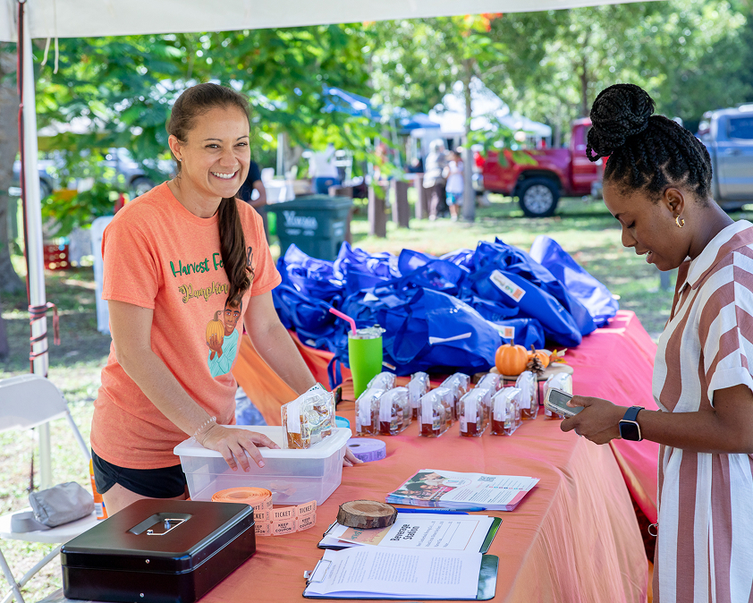
This nonprofit expands access to justice in the USVI by helping people overcome poverty through legal support and economic opportunity.

A nonprofit that provides mentorship, education, and job training to at-risk youth in the USVI—helping them build a path forward.
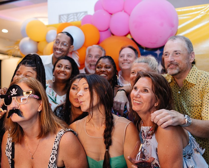
Since 2005, CSVI has worked with medical providers and community groups to support people in the USVI impacted by cancer.
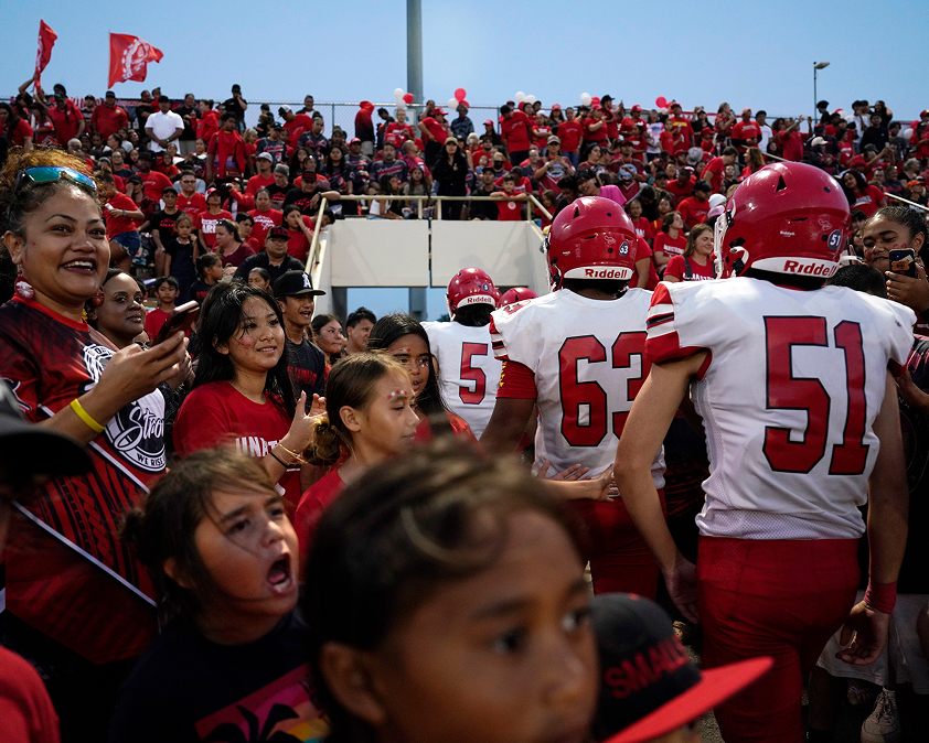
The football program has always been at the heart of the Lahainaluna community. In the wake of the fires, it has become even more important—providing stability, support, and hope for players and their families.
Eyebrow
This is the body.

Eyebrow
This is the body.
01
Body copy for this card.
How We Support You
We work in affected communities to understand what happened and who was impacted.

That includes gathering documents and evidence, reviewing information, and working with our experienced legal partners.

We work alongside our legal partners to help people harmed by corporations hold them accountable.

We use cookies to provide you with the best possible experience. They also allow us to analyze user behavior in order to constantly improve the website for you.